Card Buttons
Card buttons are the buttons displayed along with an image and message.
In a chatbot, Products card contains an image, message containing price & brief description, along with action buttons such as Buy now, Know more, etc. Buttons displayed in these cards are known as Card Buttons.
1. How does it work?
The sheet contains 3 mandatory headers and 2 optional headers.
Description and flow are only for reference purposes. Whereas tag, button utterances, and button payload are needed for the flow to work.
Below is the description and sample value for better understanding:
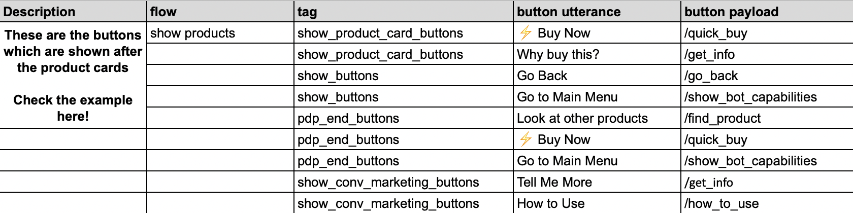
| Header | Type | Description | Sample |
|---|---|---|---|
| Description | Optional | Contains description of the flow | These buttons are displayed along with the product card |
| flow | Optional | Mentions the step at which the button needs to be displayed | show products |
| tag | Mandatory | This is the keyword used by the bot in the backend to trigger the product card. This should be selected from a pre-defined set of values. Each value corresponds to the respective flow and has to be chosen from a list of available choices. | show_product_card_buttons |
| button utterance | Mandatory | This is the button content/title that will be displayed to users. | ⚡️Buy Now |
| button payload | Mandatory | This is the message that is passed by the respective channel (WhatsApp/Chat Widget/FB Messenger...) in the backend when the option is selected by the user. This will help our platform detect the user intent and respond accordingly. This should be selected from a pre-defined set of values. Each value corresponds to the respective Button Utterance. | /quick_buy |
In the above example, “⚡️Buy Now” option will be provided to users along with product image, and description.
2. Sample Data
Below is a screenshot of a sample System Configs sheet:
3. Reference
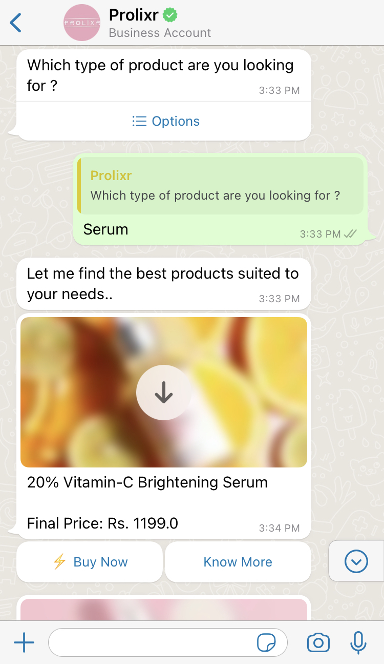
Product Card with Card Buttons - WhatsApp:
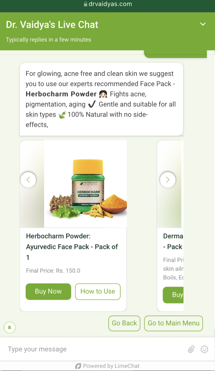
Product Card with Card Buttons - Chat widget:
4. Best Practices
- Do not add more than 20 characters in the button title since it’s not supported on WhatsApp channel. If the limit is exceeded, it will be sent as a standard message with Serial numbers.
- Button Utterance/Title and Button Payload can be different.
- Only characters and emojis are supported in card buttons.
- Do not add additional columns since they would not be recognised by the platform.
- If there is a request for a new configuration (e.g., Button to load more product images), then raise a request along with all the details. Product team would then go through the requirement and take the necessary action.
caution
⚠️ This is the link to the list of suggested Card buttons along with pre-defined button payload list, descriptions, and sample flows.